
Artist Christian Boer developed a typeface to make it easier for dyslexics to read. What are you doing to make your learning programs as accommodating?
by Kate Everson
December 5, 2014
I have a lot of magazine and print designer friends, and the first thing they’ll tell you is that Comic Sans is the worst font ever created.
Why this typeface is the subject of so much animosity is still a mystery to me, as the only time I’ve ever seen it used is in elementary school announcements and condescending “Clean up your mess” signs in company kitchens. Maybe I just answered my own question.
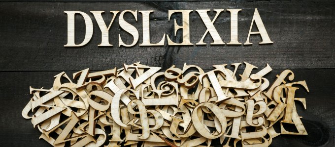
But font does affect how a message received, right down to the psychology of it. That’s why Dutch artist Christian Boer made news this month when the Istanbul Design Biennial featured the typeface he created to help dyslexics like him read better.
“Dyslexie” makes subtle changes to letters like b, p, and d, which dyslexic minds tend to flip or rotate in their heads, making it hard for them to read. Some are slightly italic, and letters like y have longer tails. It hints of Comic Sans, but I think we can all let it slide.
Before you download this for all your dyslexic employees, keep in mind not all dyslexics are the same, which means accommodating them is a little trickier than say, printing a training guide in a different font.
Ben Shifrin, head of the Jemicy School for Dyslexics and vice president of the International Dyslexia Association, said understanding the big picture around dyslexia — a genetic condition that affects how someone processes language — is the first step to tailoring learning for employees with the learning disorder.
“When we’re born as children, our brains are wired to learn language and speak,” he said. “Reading is something we’ve created, and that’s the first thing we forget. About a third of brains learn it naturally, so we assume their brains are wired for that. Then we have students who are extremely bright but struggle with the mechanics of language. Comprehension is not the big issue.”
Like most disorders, dyslexia takes different forms, which is why font changes are not the miracle cure. Shifrin said it might help those with visual dyslexia, but others would benefit more from having an audio guide that could read the text to them. A good rule of thumb here: the employee knows best what he or she needs.
That is, if the employee feels comfortable acknowledging dyslexia at all.
“Many shy away from sharing what that problem is,” Shifrin said. “If they’re in environment where it’s accepted, they will come to you and advocate for what they need. Too many times there’s an environment of fear, and they’re scared to say anything.”
Bottom line here: Be open to learning disorders, whether you know of someone in your workforce who has one or not. Chances are there is someone in your office with a learning disorder.
The International Dyslexia Association estimates 15 percent of the workforce is dyslexic, including some of the top CEOs, such as Virgin Inc.’s Richard Branson and Cisco’s John Chambers. If you’re amused or annoyed by Ikea’s Swedish names for everything, thank founder Ingvar Kamprad — he picked Swedish-sounding names so he wouldn’t have to remember sequences of letters and numbers.
I’ll never think of my lazy-Susan table topper, which I’ve continued to call a “snudda,” the same way again.
“The dyslexic brain is the one that thinks outside the box and needs to be stimulated in the 21st century,” Shifrin said. Whether that’s through auditory guides, different fonts or supplying employees with whatever else they need is not up to you, but the employee. After all, they know themselves best.
This article originally appeared in Diversity Executive's sister publication, Chief Learning Officer.